Average Decomposition Diagram
<
Previous
|
Next
|
Contents
>
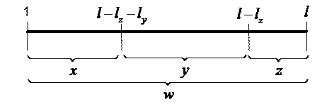
Throughout this tutorial, you have seen the diagram to represent the average. I call this diagram
Average Decomposition Diagram
(or ADD, in short). It is a simple diagram, which represents the measurement sequence and how we can decompose the average of the measurement sequence into several averages. Average Decomposition Diagram is a very useful tool to visualize relationship between one types of average to another. In the diagram above,
![]() ,
,
![]() ,
,
![]() are averages with length
are averages with length
![]() ,
,
![]() and
and
![]() respectively. The average for the whole sequence is represented by
respectively. The average for the whole sequence is represented by
![]() with length
with length
![]() , then the diagram can be read as the length weighted average decomposition as following relationship
, then the diagram can be read as the length weighted average decomposition as following relationship
![]() (12)
(12)
Rate this tutorial or give your comments about this tutorial