<
Previous
|
Next
|
Contents
>
Non-Linear Regression in Excel
Now suppose you have already the scattered plot of your data and your data is clearly has non-linear relationship (non linear means the probable plot will not make a straight line). The following steps is useful to find the best non-linear model from possible models that available in Microsoft Excel
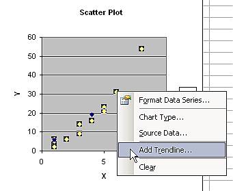
1. Click on any point of your data in the chart, then do right mouse click. You will see pop up menu.
2. Select Add Trend menu.
MS Excel provides six possible trends: linear, logarithmic, polynomial, power, exponential and moving average. Using some linear transformation (as described in the next section of this tutorial) you may see how this non-linear transformation actually works and I also add some more non-linear regression types such as square root and reciprocal curves.
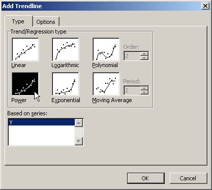
3. Since our plot is similar to power curve, we may attempt to select this trend type.
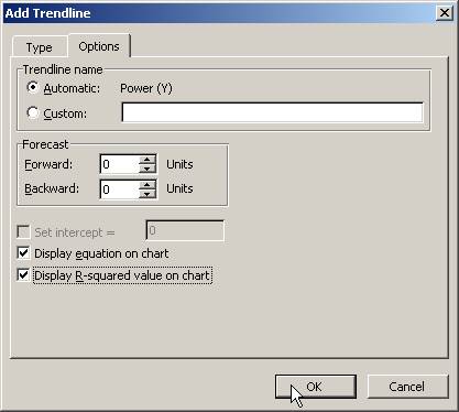
4. Click Options Tab and check Display equation on chart and Display R-squared value on chart, then click OK button.
We obtain the non-linear regression plot with the equation and R-squared value.
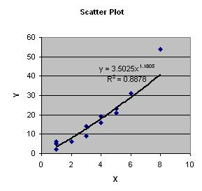
Modeling is a kind of art that you need to do trial and error. Each time, we guess what is the model (in our example above we guess that it is Power curve), then we compute the trend line and the R-squared.
Among all of our guesses, we decide the best model is the model that produces the highest R-square and tend to explain our data plot. That is why the scattered plot matters.
One more condition is the sensitivity of our prediction. Using very high order of polynomial regression, you can always get highest R-square value and best plot that almost touch or in the middle of all data points. However, this type of regression has not so much value when you want to predict something because the regression trend is highly fluctuated by the data and any outlier data will influence the trend curve very much.
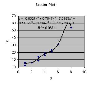
As an example, with the same data, we can plot using polynomial of order 6. The chart is shown below. You can see that even the data is always make an increasing trend between X and Y, the trend will predict Y to go down as the X increase from the highest data point. In other word, we cannot trust only highest R-squared to be our guidance to select the best non-linear model. Plotting the trend will reveals the real relationship and sensitivity of the trends also matter.
In the next section of this tutorial, you will also learn non-linear transformation. Some of the models are not provided directly through MS excel trend chart.
<
Previous
|
Next
|
Contents
>
See Also : Regression tutorial , Power Rules , Logarithm Rules , Kernel Regression
Rate this tutorial or give your comments about this tutorial